
HT3 Refresh Project
Role // Graphic Designer | Client // Hightower Advisors | Designed in // Figma
In October of 2025, Hightower Advisors rolled out a new brand, internally referred to as ‘HT3’, with a heavily refreshed look and feel. Though the core elements stayed the same, the brand was visually distinct from HT2, the prior iteration, and a far throw from HT1, the originating style of the brand when Hightower was founded in 2008. At the time of HT3’s launch, over 35 Hightower teams (individual wealth management businesses) were considered “Hightower brand-to”, meaning they used a version of Hightower’s branding and name.
This HT3 branding brought with it a lot of opportunities to envision Hightower as a modernized brand, ready for a new era and at the forefront of wealth management. However, it also brought with it a challenge: the now greater disparity between Hightower’s corporate branding and teams whose practice branding and website had not been updating since the days of HT1.
Project Origination
Thus, the HT3 Refresh Project was born – originally designed as one of my annual performance goals, and later evolving into a much more involved cross-functional collaboration across our marketing, web, and advisor services teams. Since many of the teams we would be reaching out to about the new branding had not engaged with our internal marketing team in five or more years, I knew the approach we took to this project was crucial, and would also impact how well this project scaled.
Therefore, I sought out to create a project structure that operated within a set of specific parameters, yet could be customized to a necessary degree, and thought about the scale implications from the beginning for our design and development teams.
Prior to reaching out to the first team, I completed the following steps:
Drafted a templated powerpoint introducing the new branding, the HT3 refresh project, space for customized recommendations tailored to each practice, how the refresh would positively impact the team, and a page of resources
Conducted a UX evaluation of all of our Hightower brand-to websites, determining relative redesign priority. This information was transferred to our team advisory business brand and design Asana board, with a column listing each team as high, medium, or low priority. The 20 high-priority teams became the focus of phase 1 of this project.
Presented the templated deck to our internal digital product team, some of whom would become project managers communicating with the advisor teams, and some who would be developing the sites. The presentation was revised to be more concise in some areas and more specific in others based on feedback from this initial presentation.
the hightower brand evolution
HT1 Branding (2008-2021)

HT2 Branding (2021-2025)

HT3 Branding (2025-present)

The Procedure
The design process for each team’s refresh project was as follows:
stage one
Initial discovery call with the team, which includes the presentation and a discussion with the team’s stakeholders.
stage two
Full redesign of the team’s website, including a copy audit, within the subsequent 1-2 weeks.
stage three
The redesigned website is sent to the team for feedback, with an ideal timeline of 1-2 weeks
stage four
Revised site (as needed) based on team feedback, 1-2 weeks.
stage five
Submit the newly revised site to compliance, make any necessary adjustments, and pass the site along to our web team for development.
This process is significantly abbreviated from our typical website redesign procedure, which involves weekly or bi-weekly calls across 1-3+ months, iterative feedback, and sometimes involves a separate copy or brand design stage prior to creating the prototype. Designed to update these practices’ sites as quickly as possible, with a design system that allowed for easy scale, this revised five-stage process was successful for the majority of our HT3 site refreshes — though we later discovered an alternate route to address a repeated concern.
A Problem, and a Solution
The first team we approached for the HT3 refresh project was greatly outdated, and hadn’t been redone in at least five years. We scheduled an initial meeting with their team, successfully gained insights about what they would like to see in their new site, refreshed the copy, and had the site redesigned within two weeks — then didn’t hear back for several months. This paved way for an insight (some teams are not going to care very much about this project, if design was not a large concern for them before) and a redirection (there needs to be a low-touch option for teams who are currently indifferent about design).
Therefore, we created a version of the project where, upon sign-off from practice leadership, we would refresh the site into the new branding, revise the copy according to any new compliance regulations, develop the site, and notify the team when the new site was to go live. While there were plenty of teams who wanted the hands-on experience, this track worked well for others, and allowed for us to continue to make progress through our high-priority list.
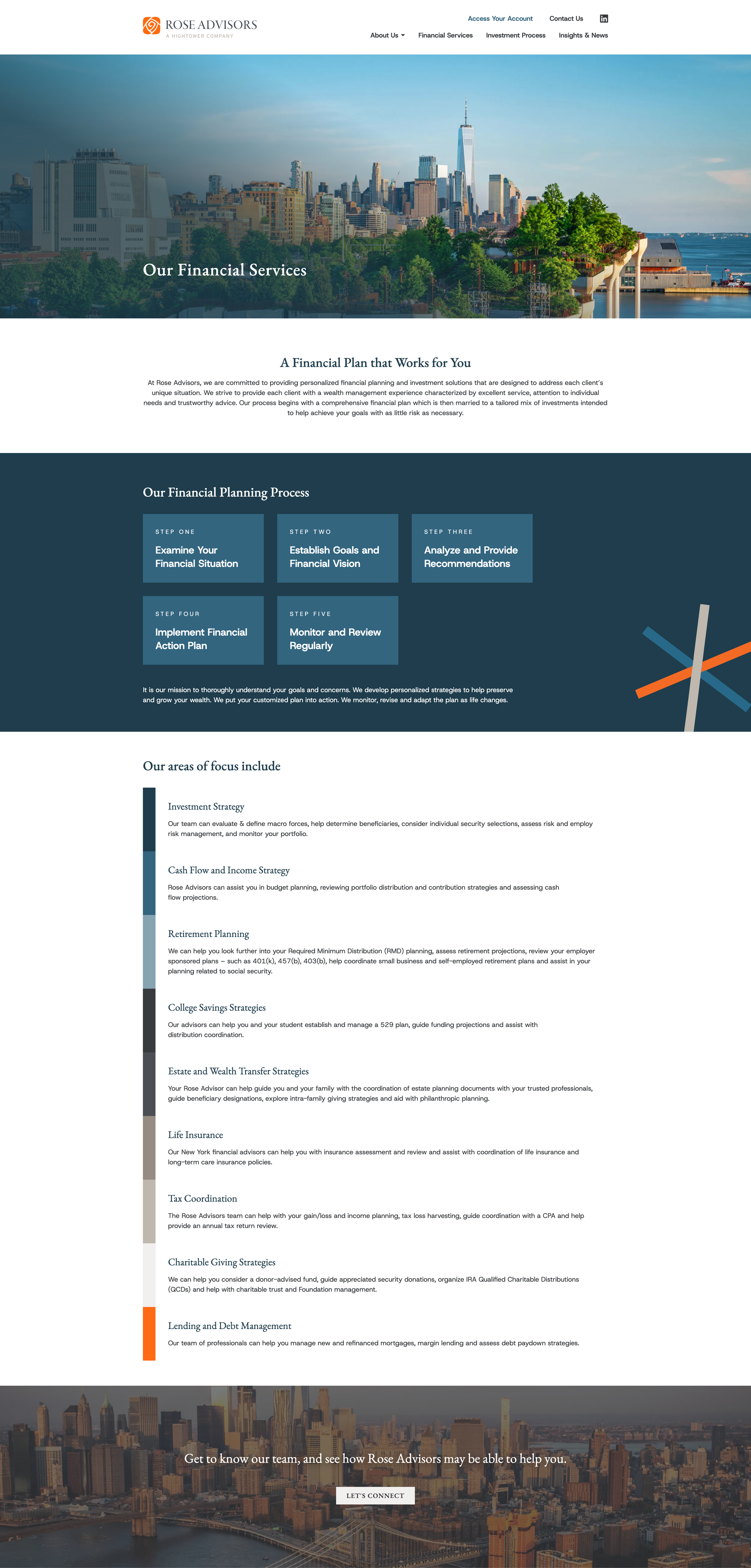
An Example: Rose Advisors
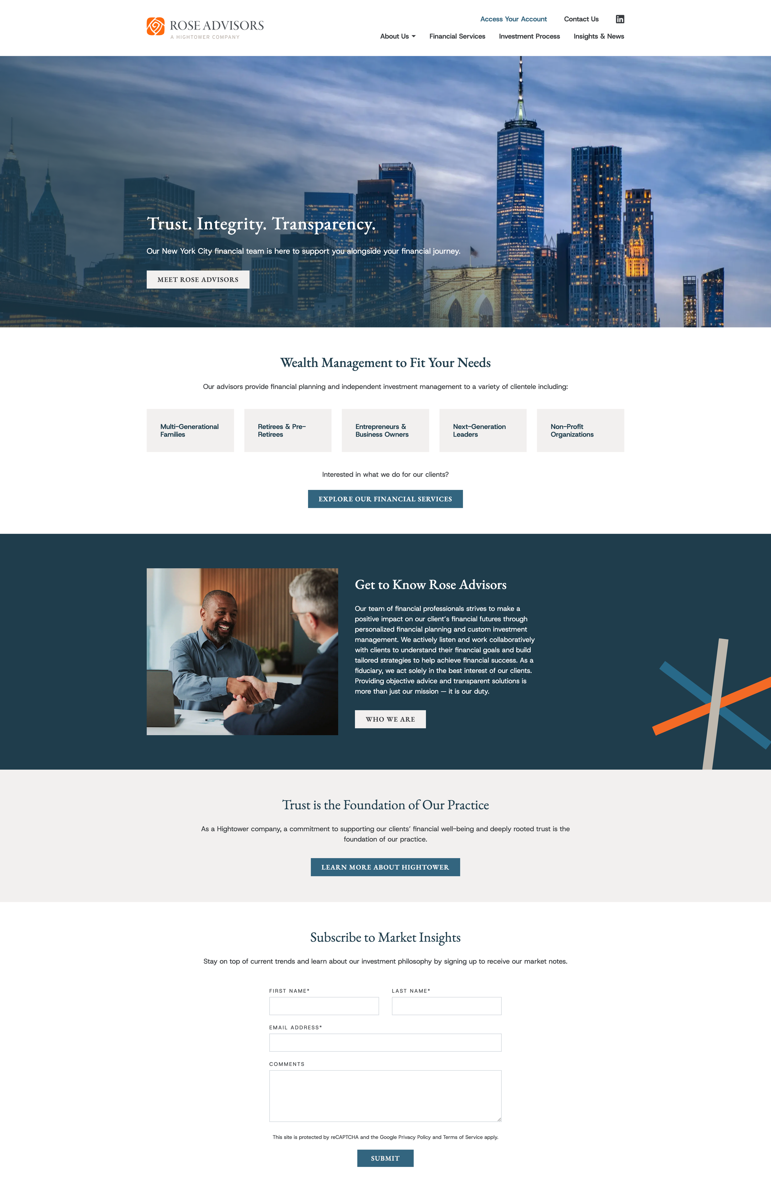
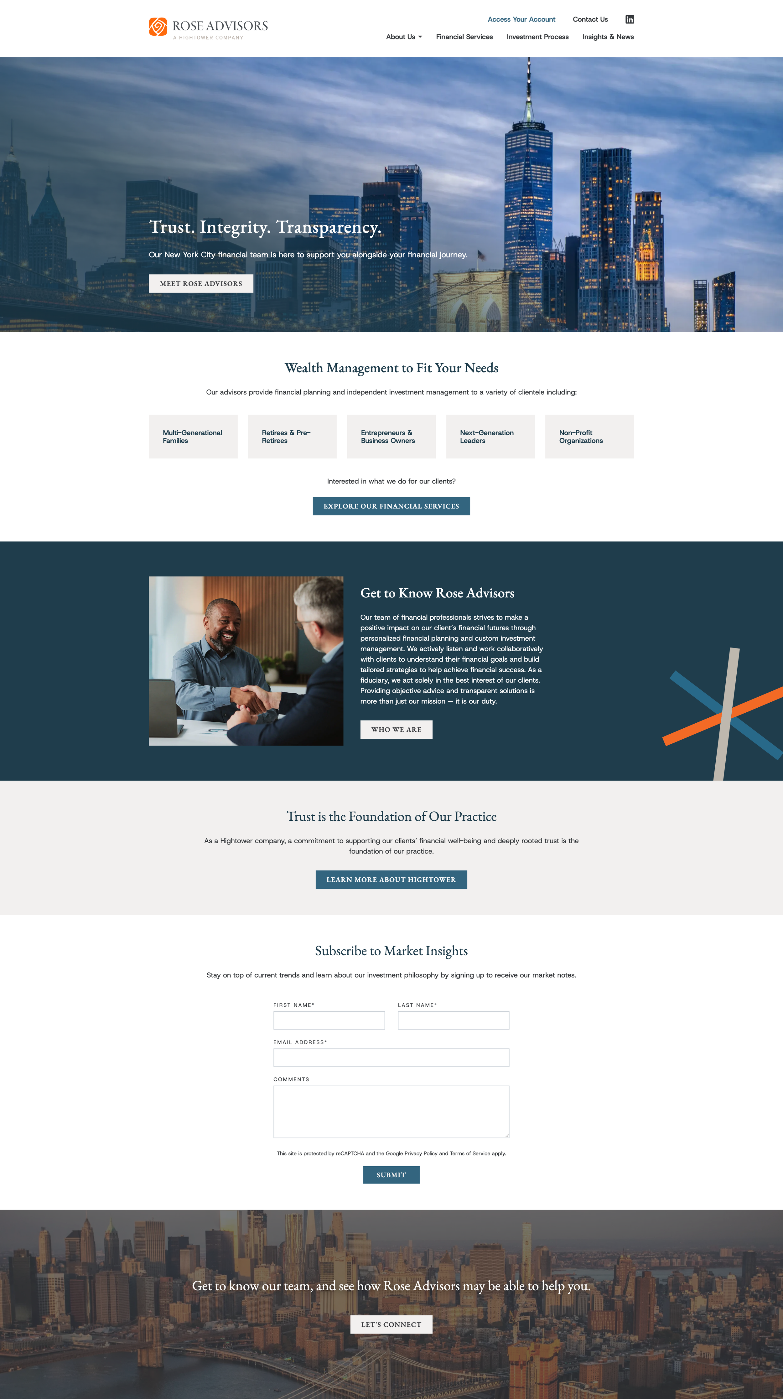
One of our early success stories with the HT3 Refresh Project was Rose Advisors, based out of New York, NY.
After gathering initial feedback from the Rose team, we refreshed the site, and passed it back for revisions. The primary considerations going into the project were that the team was a big fan of the new branding, gave us full reign over design, and that their navigation could be streamlined for a clearer user experience.
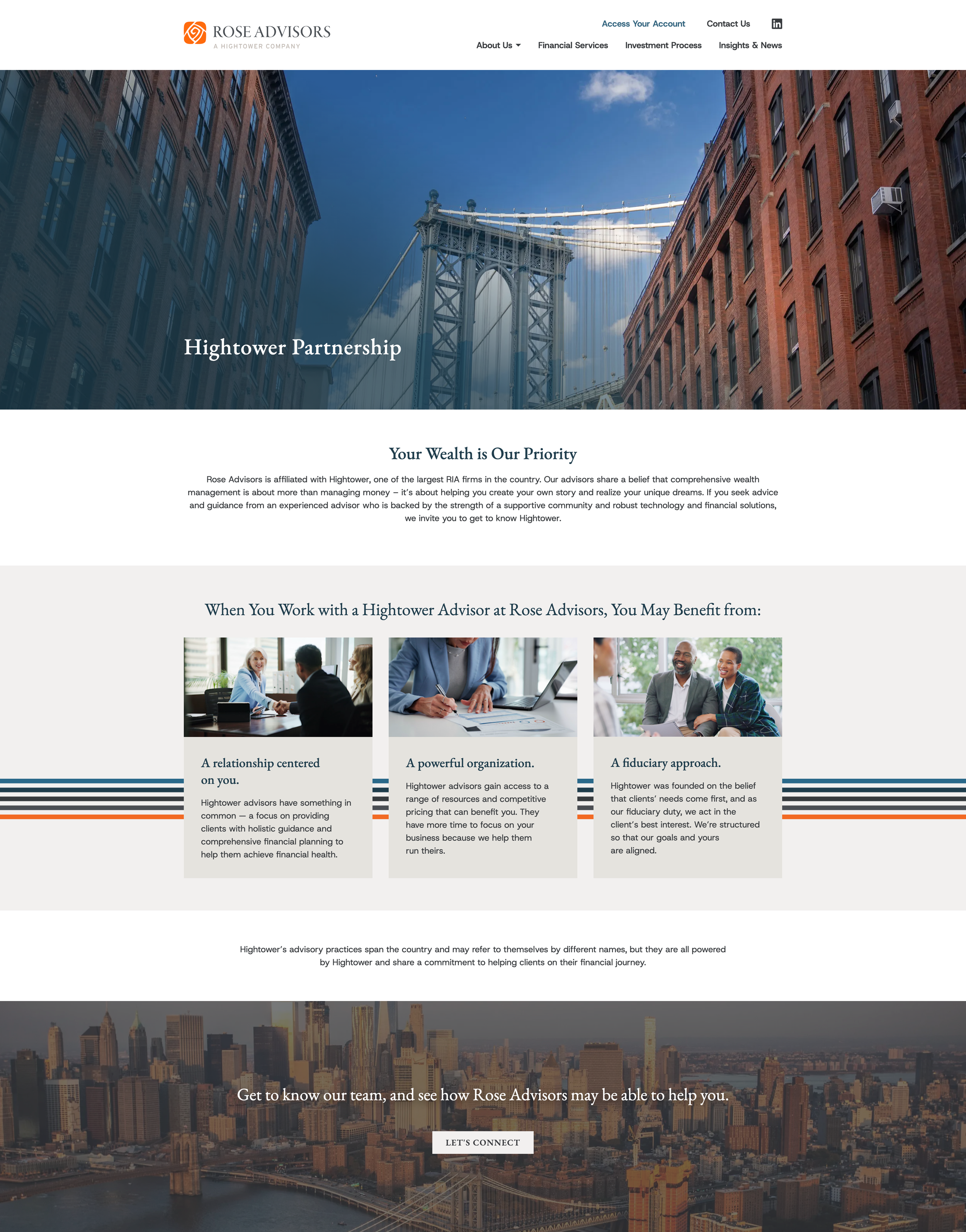
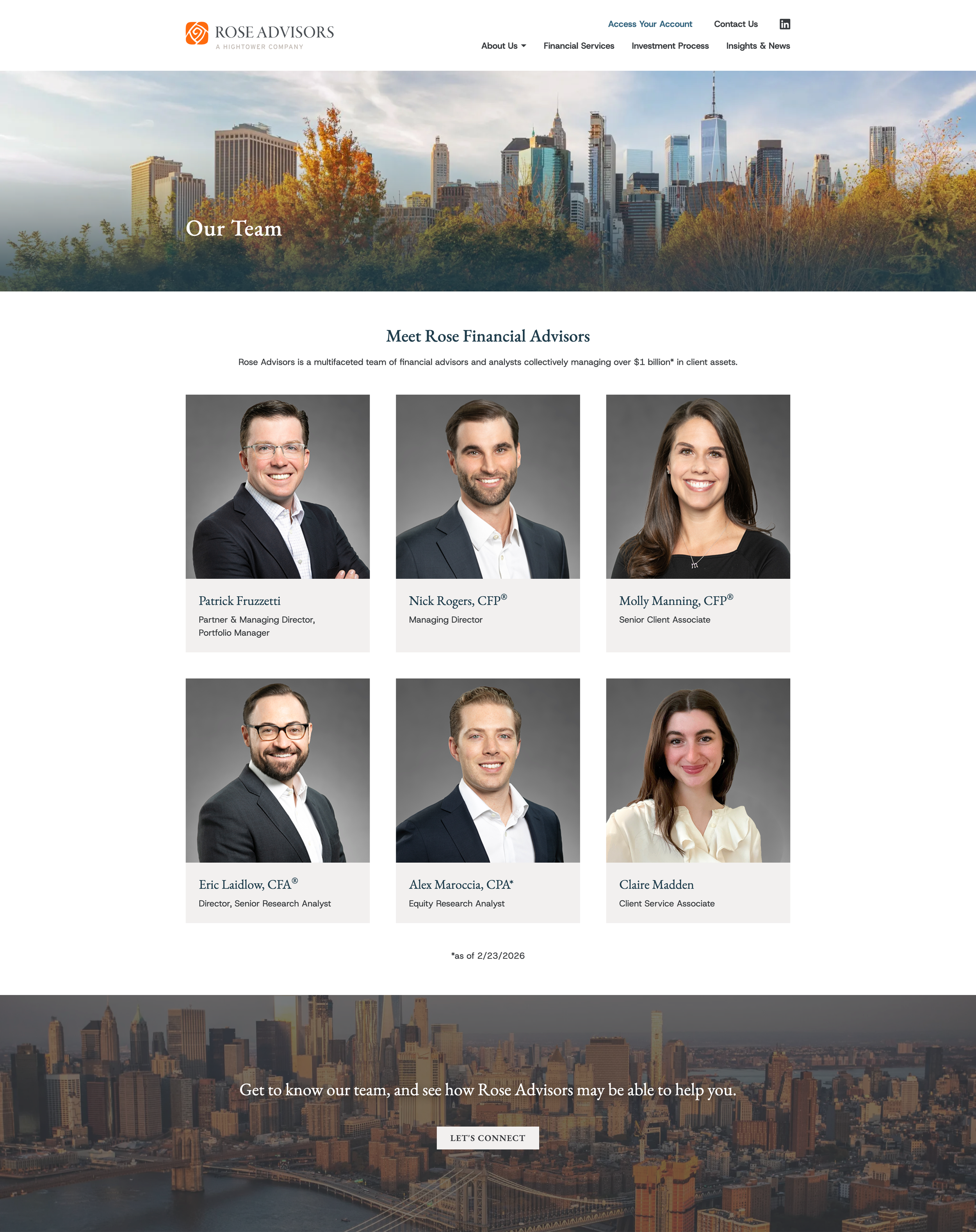
Therefore, we pared down the menu from nine to seven pages, deleting older resources pages that were out of date. We also removed ‘overview’ from the navigation — a link in the nav of many HT1 sites that just goes to the home page, a redundancy with the adoption of the convention that users can click on the logo in a navigation to return to the home page. Their team pages and Hightower partnership page were combined in an ‘About Us’ drop-down, and the visual design overhaul began.
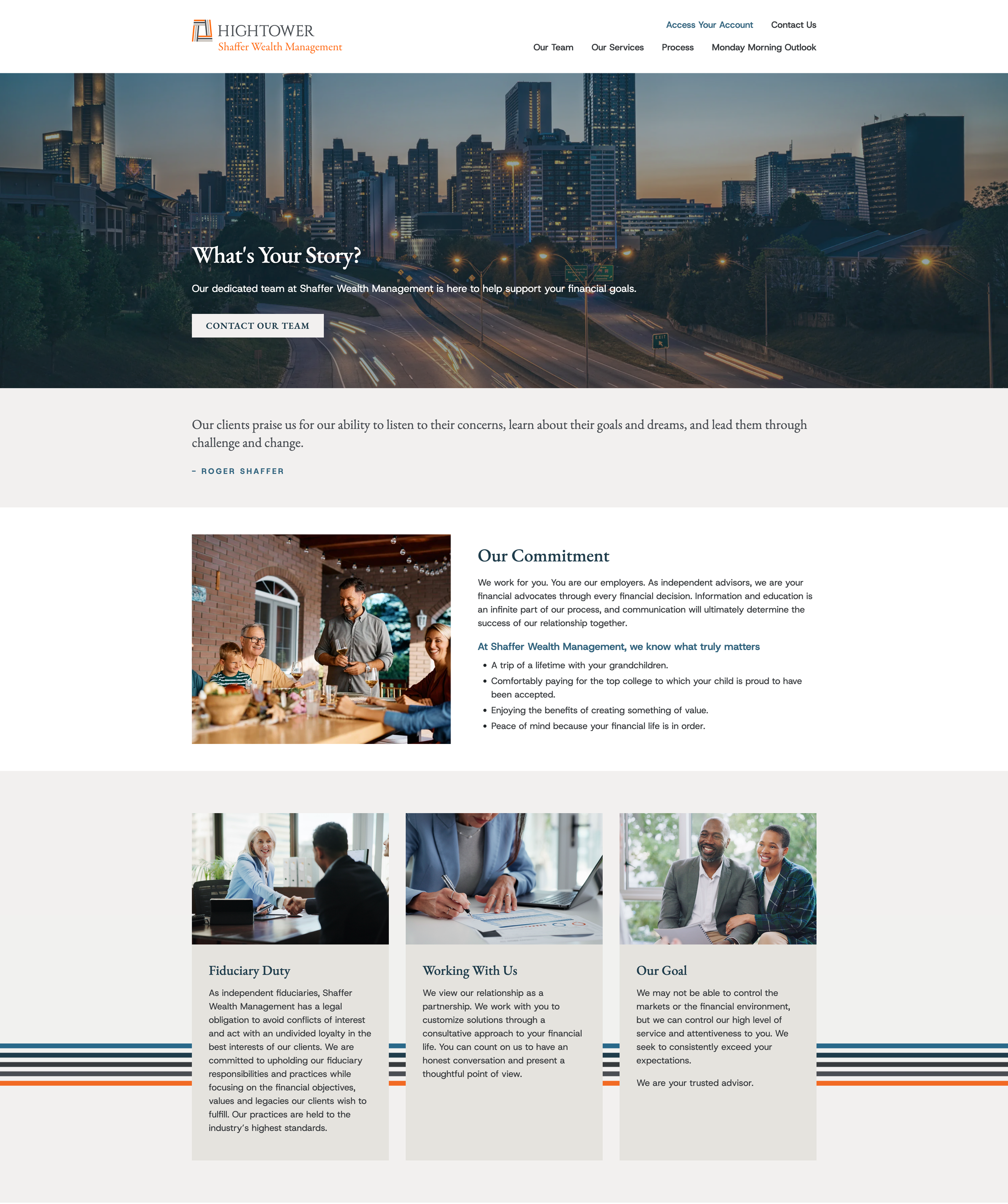
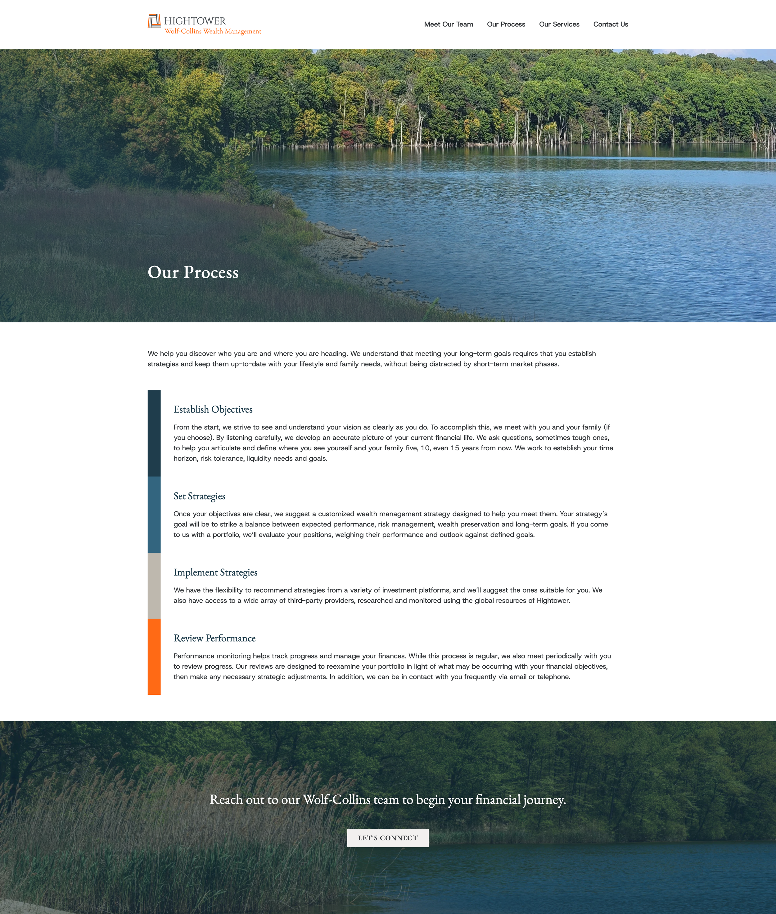
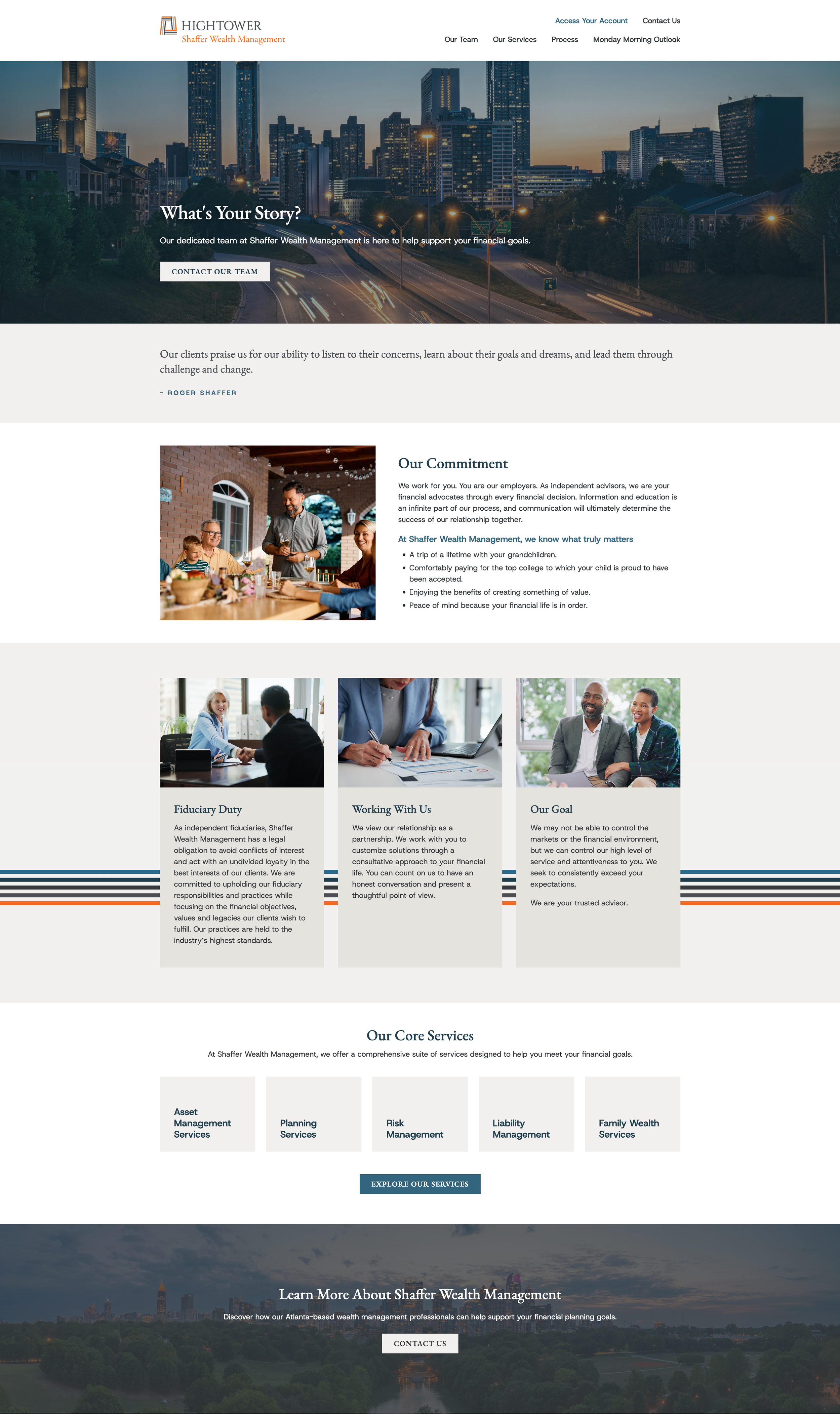
By the time we reached Rose Advisors’ site, our design system had begun to emerge — reusable, repurposable design components that existed across all of our Figma files and sites. Therefore, designing the site was quick, efficient, and modular — not only reducing the strain on myself as the designer, but also on our web team, who can copy elements from existing sites instead of recreating them with CSS.
A Design System Built for Scale
As a byproduct of trying to streamline this project as much as possible, a Hightower brand-to design system emerged. While we have always had brand guidelines and plenty of examples of brand-adherent collateral, we did not yet have a centralized set of assets and components in Figma to be utilized across our brand-to sites.
Hightower adopted Figma in late 2024, and did a bit of assembling the car while we drove it. With our small, two-person design team responsible for all design collateral across over 100 individual practices, we were unable to scale back operations to take time to optimally set up Figma for our firm at-large. As we began and prioritized this project, however, it became obvious that a design system that modularized these new HT3 websites would be critical in this project’s success.
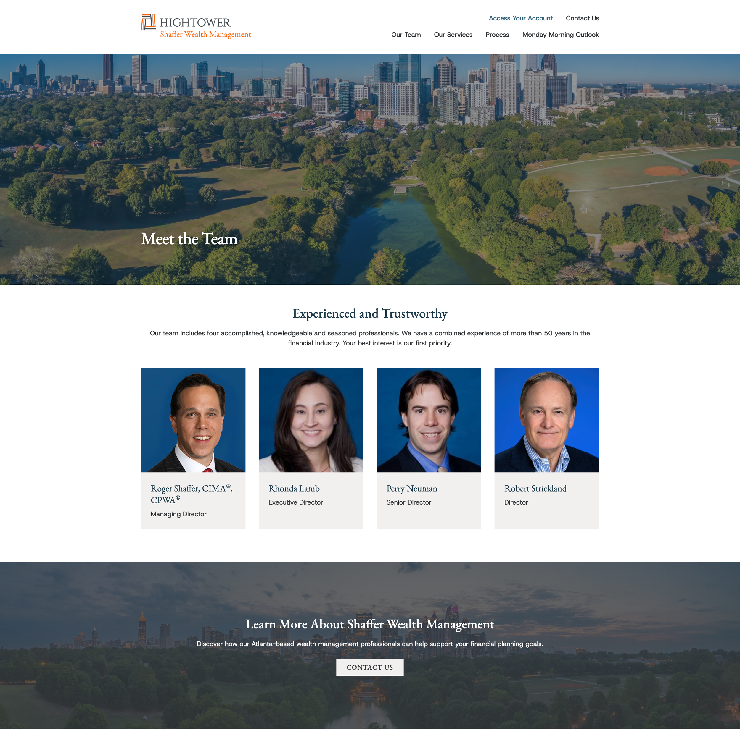
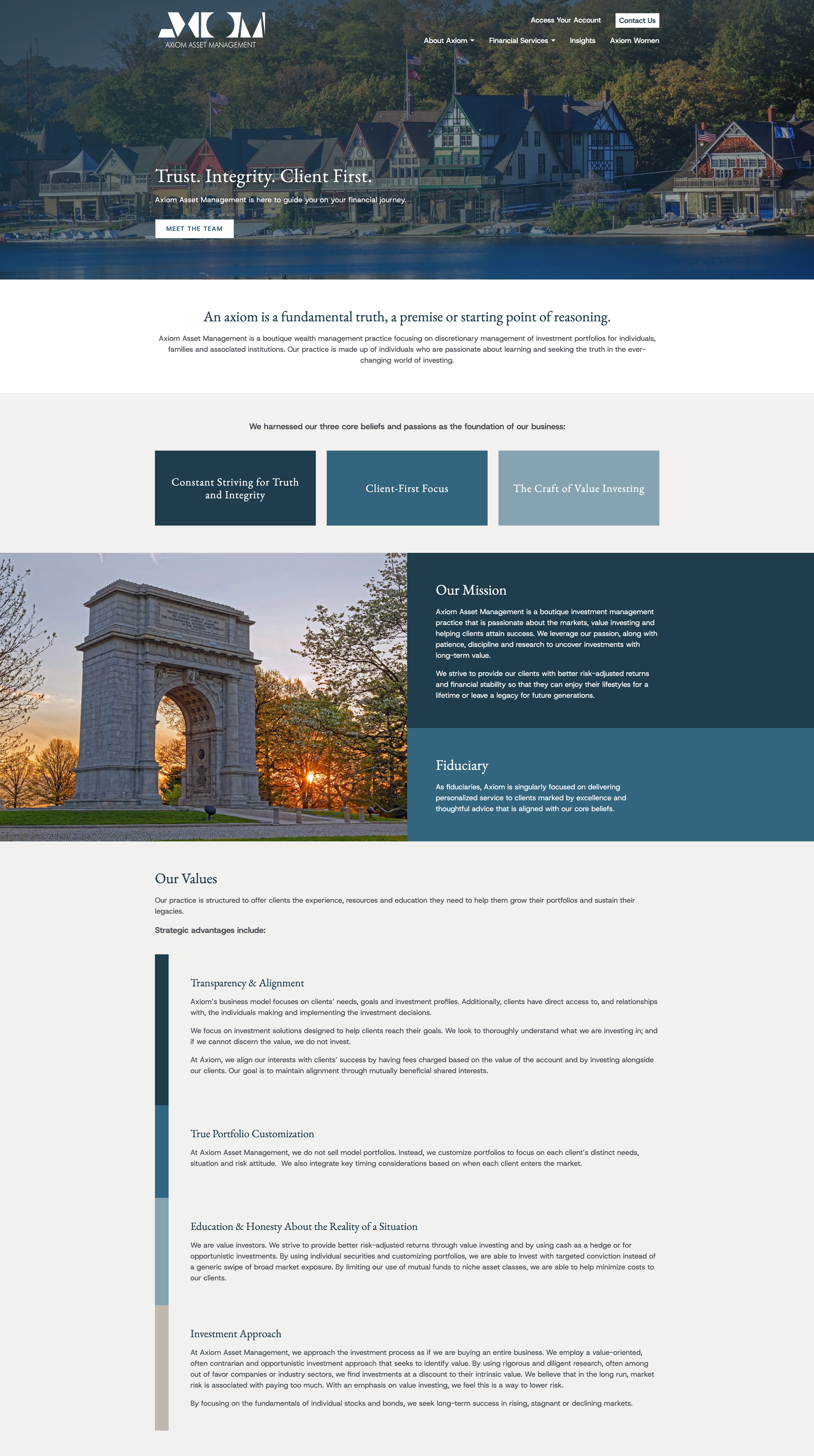
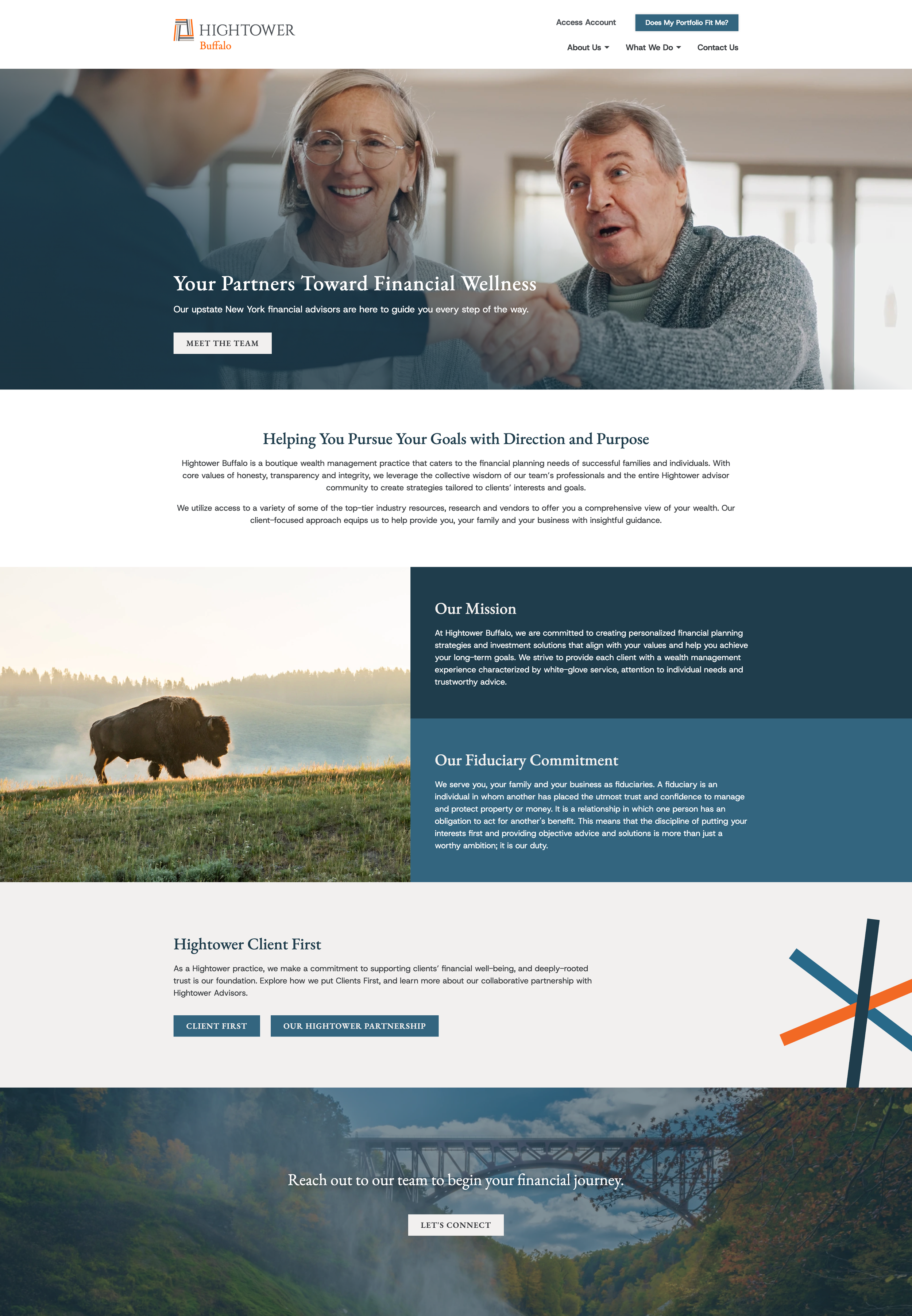
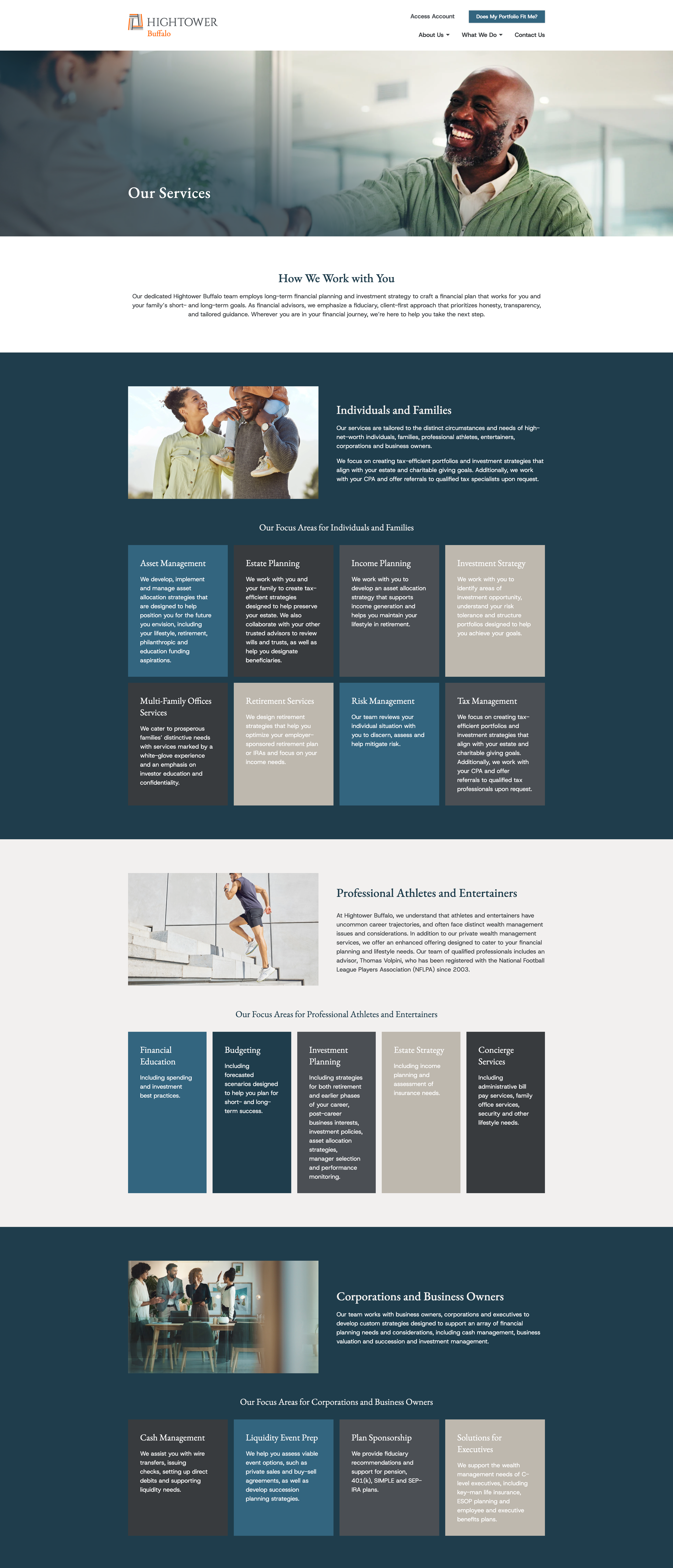
Thus, from a brand guidelines document, a design system was born — with card styles, buttons, forms, layouts, and other reusable components. Not only did this system allow myself and Natalie, my manager and the other member of our design team, to design very quickly and efficiently, but it also created a system where our development team could copy elements from site to site, reducing both design and development timelines.
design systems at work
Outcomes & Takeaways
The HT3 Refresh Project has been my most challenging, most involved, and most rewarding project so fur during my time at Hightower Advisors. Some of my most notable takeaways & the most significant outcomes of the project so far have been:
The SiteImprove scores for our sites have gone up significantly with the reduction in key usability issues like broken links, navigation issues, and size/color accessibility metrics.
With more and more of our websites sporting our latest branding, our overall Hightower brand becomes more robust, with the ideal end goal that Hightower is equally as well-represented on our least-visited website as on our (soon to be redone) corporate website.
Our new design system will allow us to quickly and easily scale into our medium and low priority websites, and is informing design system setup for other brand-away practices as we redesign their sites.
This project and our newly adopted habits when beginning new site redesign processes have greatly sped up our workflow, and we are producing sites at a rate 2.5x faster than we did in early 2025.
Design systems are worth the time to set up, establish, and enforce, as they save time and effort for all members of the team.